31/10/2013

Studio Brief 3 - A Day in the Life

Final Outcome

I have tried to create layered imagery that illustrates a chaotic mind overrun with thoughts and the constant connection between humans and the digital world. I feel like this style of working is much better at communicating the negatives related to the digital age. My favourite of the three is the landscape illustration, which shows a group of people being notified of things they need to do, I have tried to show this through visual references to the notification signs used in mobile phones and social networking. The faces are featureless/expressionless because the onslaught of technology and it's power has sucked them of their ability to enjoy things properly, like going for a meal with friends as stated in the article. 

There is evidence of layers of work which are also part of the developmental process in creating these illustrations. I found that I was able to combine black and yellow to create an extra colour to work with. Smearing paint and contrasting it with block areas of black breaks up the images and highlights areas of text I want the audience to focus on. Looking back at my work I am unsure about the hashtag reference to twitter in the portrait format, I think the way I have a written it is incongruous with the rest of imagery and almost looks like an afterthought. Small detailing has played a part in creating 'busy' pictures, for example I made use of charcoal, byro pens and stitching thread to show distress and complexity.

If I were to do this brief again I would research further into the anatomy of the brain, which I think would give me a lot of inspiration and ideas to work from. I think it would be good to try and respond to the article from a narrative point of view, I feel as though my work doesn't really connect on a personal level and is sometimes a bit 'cold' in the delivery of its message.

I have learnt a lot about the importance of format and composition on this brief, which directly affects the dynamism of the image and how successfully it communicates. Limited colour has been interesting to work with but is a limitation I would rather not work against in the future, I kept finding myself wanting to add something more and feel as though the work is missing something. In future I will constantly be thinking about these important elements that make up a picture even from the very initial idea sheets.


Group Crit


Self Evaluation

28/10/2013

Studio Brief 3 - A Day in the Life

Berenice Abbott's Science Photography

Berenice Abbott's photography of physics experiments has really inspired me with the repetition of shape and line that really communicates a sense of balance, which is ties in with my ideas about thought processes. There is an 'out of this world' eerie aesthetic to them and the shapes fit there formats perfectly, for example the sideways pendulum which looks great stretching from one end to the other - if it were placed within any other format I don't think this photograph would be nearly as effective.


I have been looking at working on top of paint and using bolder marks with ink and cut paper to create much more spontaneous and dynamic drawings. This style of working seems to be much better suited to my subject matter. I definitely want to incorporate this way of working and the overall aesthetic in my final three illustrations. The subject matter and final decisions as to what words and drawings to include will come to me as I create the finished pieces of work. I have found that my style of working focuses on merging development work and finished work into one thing. I choose to work on one piece and constantly change it by going over mistakes or sticking something else on top and this image eventually becomes the final piece with all the process leading up to it acting as the developmental work which adds to the aesthetic I am after. For example the test sheet above could easily become a final piece if I were to continuously work on it. I think this is the reason I am not a fan of thumb nailing ideas which are detached from the finished illustrations, I find it difficult to focus my energy on creating developmental work that is not intended to 'look nice' but to serve a purpose for things like idea generation.

Line and Shape

Tone, Mark, Pattern & Texture


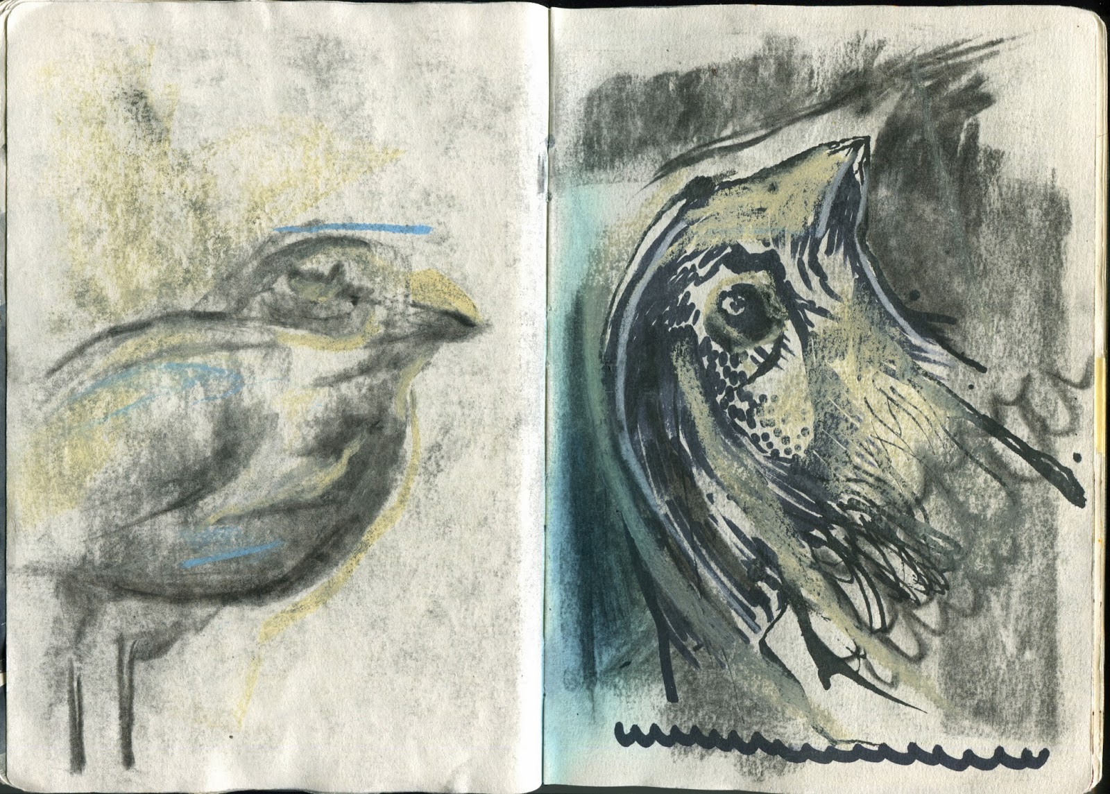
I have been working with line to create areas of detail and complexity - shade/dark - combining the weight of the lines used and the direction to add texture and pattern that brings to life what would normally be very flat areas of colour - lots of small mark making creates direction


I am looking at the Galapagos Islands and am making drawings of reference from my visual research. Drawings of maps of the Galapagos Islands, trying to combine shape with line making to create strange cropped juxtapositions. Areas of intense colour complemented by the finer more delicate use of textured line making - oil pastel good for blocks of colour - overlapping - erratic


Looking at the 'Darwin's Finches' and his theory that the physical variations between each type found on the Galapagos Islands points to evolution. Using water colour to build up gradual layers of basic shapes - busy - crowded - evolving from simplistic forms - highlighted by line work


Line to create areas of pattern that implies a textured surface - feathers - I have noticed that in order to create a softer looking surface a lot of line work must take place, but a harder looking surface requires less mark making - reflects how many particles make that area up


Contiuous line - forced to study figure of bird without looking away/needing to adjust line work and therefore compromise the visual study


Playing with flat shape and overlapping colour to create simple studies of more islands - Photoshop is useful for creating various shapes quickly and rearranging them to affect the compositional elements - The shapes are fairly rough - imperfect - curved lines and mistakes connote ideas of harmony and most often reflects nature - harder lines and edges appear mechanical and man made - grid lines - map


Studio Brief 3 - Concepts/Ideas/Format

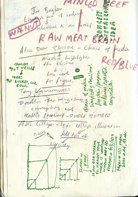
The concept is the underlying theme or the main topic of what you are trying to communicate, whilst the ideas are different ways to represent that. I looked at trying to simplify and better communicate the brain by focusing on the shape, patterns and texture.

  • 16 landscape pieces of paper - considering form - strong and dynamic imagery
  • Thinking before I make a mark on the paper, taking time to evaluate composition
  • New possibilities - flipping the canvas - Some ideas can only work in one orientation and are transformed when rotated


27/10/2013

Studio Brief 3 - A Day in the Life


I have been thinking about trying to incorporate photography into my work in order to create digital collages. I think it is important that I start to use Photoshop in the same way I use paper and scissors, making use of the layers as I do with analog techniques. I have been looking at the texture of minced beef and how it could be used to resemble a cross diagram of the brain. By altering the lightness and darkness I have also been able to create contrasting imagery whilst maintaining a 2 colour palette. Now I can see how this could be applied to my initial drawings I am unsure about the overall aesthetic quality in relation to my text but will definitely come back to working like this. I think a busier and more erratic aesthetic is needed to try and communicate chaos and disorder within the brain, I will need to make use of more organic and textural materials to layer up this 'chaos' onto paper.


25/10/2013

Studio Brief 3 - A Day in the Life - Ditch the smartphone to optimise your bandwidth

Blue/Yellow/Red

After reading through the article more fully and getting a better understanding of what it is trying to say I am looking to illustrate our modern world where technology and humans coexist. It was mentioned by someone on my initial ideas sheet that technology has created a 'haze' of data constantly infiltrating our minds. The colour limitations could be used to show this haze percolating through towns and cities, for example yellow descending on blue.  

I have been looking at the three different formats required and how to work inside them without compromising my illustrations. I initially wanted to create an image that spread across all three formats to make up one final illustration, but they would then be dependent on each other in order to communicate. I need to focus on having similar design language between all three that unifies them as a series even though each image will be different.


  • Buildings featuring technological elements - dial pads - subtle references throughout
  • The stretching and expansion of the brain - capacity - overloaded - preoccupied
  • Hurdles - jumping over oncoming obstacles represented by emails/tweets etc?
  • Need to think more about format and its relation to imagery - don't over complicate
  • I really want to create one image across all three formats - can't do this - need to try and think of different concepts that can sit alongside each other
  • Pop culture - digital age - logos - twitter and hashtags #
  • A bus that everyone has jumped on to - can't get off - endless feed/road of information
  • I need to think about varying my use of media - do I want neat and clean? - could be chaotic and messy like the brain


Concept Crit

My crit group seemed to like my initial drawings using water colour pencils, and I feel as if I have explained a good range of ideas so far. However I think I may have stuck to one type of media for too long, since I was caught up in generating ideas. The group suggested I look into collage and changing up my drawing tools. This will hopefully allow for some ideas to grow as I reinterpret them through new ways of working, which was noted on one of my feedback sheets. I need to go back and try to focus on a few of my ideas for now, and possibly look at incorporating more than one of serial tasking drawings into one idea. I am unsure about how much I should look into collaging my work, since I have done a lot of that before and feel like I need to look into something new like painting for example.


23/10/2013

Studio Brief 3 - A Day in the Life

Brief

For my third studio brief I have been given this article http://www.wired.co.uk/magazine/archive/2013/10/ideas-bank/ditch-the-smartphone-to-optimise-your-bandwidth and am required to visually communicate my response with three illustrations at 200mm x 200mm, 105mm x 200mm and 290mm x 105mm. I am only allowed to use two colours plus stock (the paper) and all three of the illustrations must work as a set or series and be visually consistent.

The article talks about time management and how people's constant 'serial tasking' affects their productivity. The main themes that stand out to me are procrastination, balance and distraction. It seems as though we as a society are always tied to our mobile phones and the constant flow of notifications, emails and messages are affecting even simple things like dinner with friends. It almost reminds me of a bionic world where humans and technology have seamlessly integrated to form new generations of people who will grow up with this being the norm. Below I have found some images I feel communicate and sum up this idea of constant distraction.


Idea Generation 21/10/2013


I found that this exercise helped me in linking metaphoric and literal symbols, and thinking of ideas for another person's set of words got me to think more outside of the box as it was not my own project to worry about. I'm not sure if this is a bad or a good thing, since a lot of people made really loose abstract connections that could prove to be difficult to draw ideas from. The contributions made to my sheet are very logical and literal, I feel that I need to approach my illustrations in this way otherwise the message may become lost in abstract translation and too 'out there' concepts. It will be a challenge to still be visually creative with a more direct subject matter, which is something I'm not used to.

22/10/2013

Photoshop Induction - Session 2

Layering

Today we looked at using layers and the masque tool to add colour and texture to our illustrations. I don't usually work in this way and am finding it difficult to translate my ideas onto the computer screen. I think this way of working is good for enhancing my hand drawn work, but I still need to spend a lot of time working things out and not just settling for a sub-par image that was easier to make. In this illustration I tried to use images of sand and layer them behind areas like the hands, I am unsure about using textures in this way and think I prefer my own analog methods. I don't want my work to become too digitalised, the aesthetic I am aiming for is more hand made which I think brings a greater sense of personality to my work.


21/10/2013

Studio Brief 2 - Your Initial Brief (Photoshop)

Adding Texture/Colour

Throughout this Photoshop Brief I have been learning how to visually enhance my drawings through adding textures using layers and the multiply tool. I have been scanning in pages from my sketchbook and adding blocks of colour, making use of the paintbrush tool and the opacity levels to add depth to the images. I have learnt some good basic skills to take forward and refine, I have been able to visualise my ideas much quicker using Photoshop and now have even more room to experiment within my practice. It's exciting that I can combine analog with digital and still produce work with a similar look and feel to before, but now with more flexibility and options.