Whilst working in Photoshop it is important I am in CMYK mode, I have never really considered this before but I have seen a clear difference in colours when saving work in cmyk mode and trying to display it on the internet - it changes the image. I am hoping the colours do not appear to dull or washed out when finally printed.
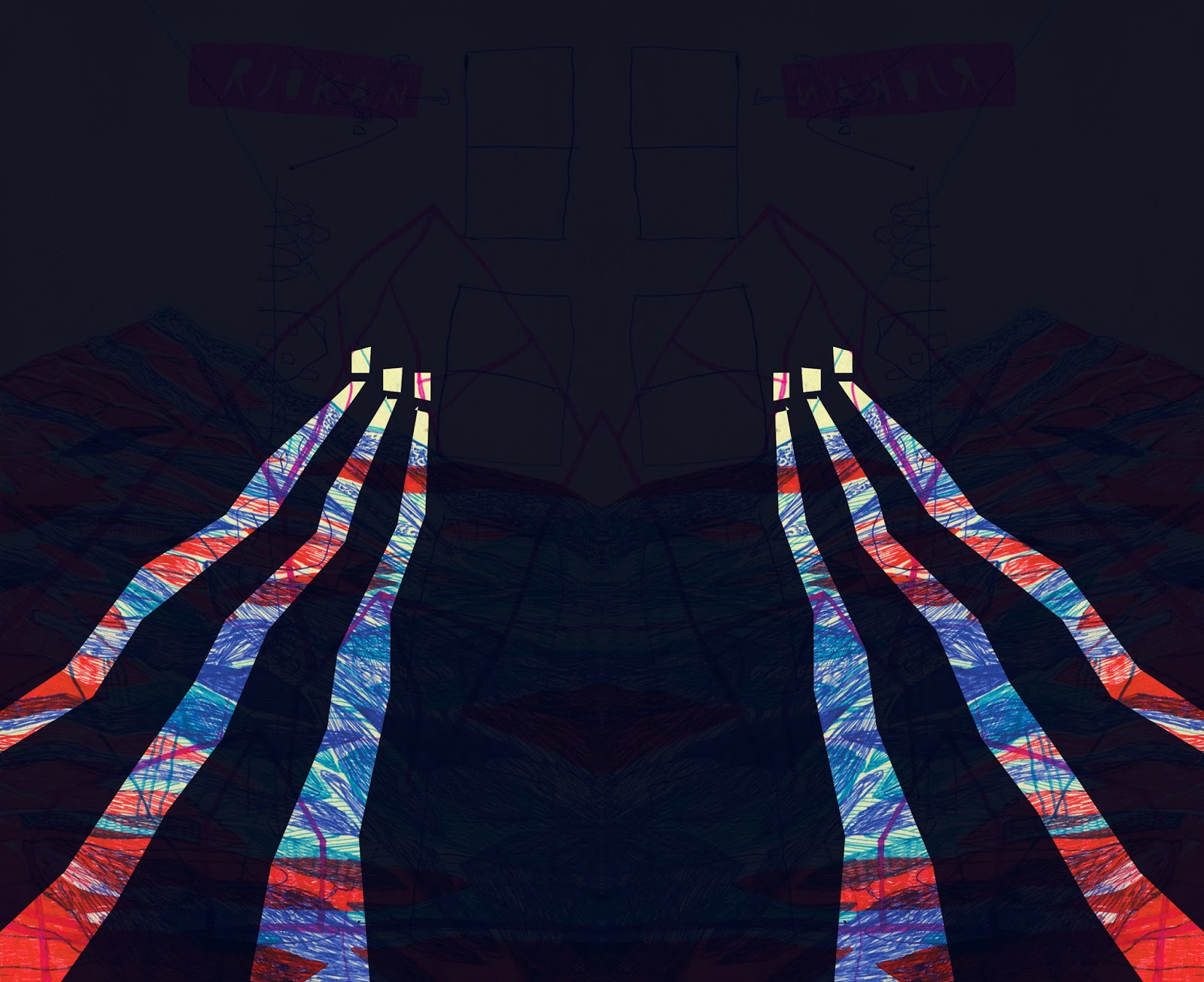
- I have been overlaying slightly transparent layers over my drawings and cutting bits out with the lasso tool to create the beams of light I am looking for. Bright - contrast - colour - texture - flat
- I tried this out with analog methods too - using tracing paper to layer up imagery


- Transparent layer too dark - when printed might just appear as solid block of colour


- Negatives - invert? Light and dark? Not keen on the browns...
I asked my friend to have a go messing about with my images and I really liked the random areas of colour and shapes he started to fill in - he said it was a shame to completely cover my drawings with an almost opaque layer of blue.

Now I am experimenting with block colour and brushes to digitally paint over my work in layers, I am really excited by the quality this gives my work - the texture I have achieved using digital brushes gives it an added sense of depth. I really want these areas of colour to stand out.


Applying these methods to my work and duplicating translucent areas of colour that run throughout various layers of the image - creating a world - colour is key in communicating the light - playful drawing language - obvious cut lines between imagery - the shapes have rough edges and are imperfectly drawn - translating my analog qualities onto the screen
No comments:
Post a Comment