After finishing my work for OUIL405 on the Norwegian town Rjukan I have decided that I would like to continue the work and also make drawings about another part of the town using all of the key elements like shape, pattern, line etc. that I have learnt over the course of this module. I have been looking at Norsk Hydro Rjukan, a plant that manufactured chemicals for the production of fertilizer between 1907 and 1991. I think it is a good change to be making drawings using subject matter of a mechanical nature in contrast looking at the Galapagos Islands, it involves different line work and use of shape. Harder lines - more linear - considering angle and proportion


Drawing machinery and mechanics from reference - Rjukan mirrors - I like the contrast between the finer detailing of the pen drawing and the burst of heavy block of oil pastel - working like this gives the picture a balance and added sense of energy - light beam
Overlaying yellow oil pastel affects the colours underneath - mutes them and gives them a warmer tone, I especially like how the blue pen line drawing stands out from behind the layer of yellow - makes uncovered areas stand out even more

Sam Eyde, the artist whose idea it was to install the mirrors in Rjukan - I wanted to try and focus on my initial line work and drawing with a reduced amount of media - this has allowed me to convey the idea and message much more effectively - simple communication


Old turbines from Vermork Power Plant (Tinn, just outside Rjukan, Norway)
Blue circles - block colour and paired down collage on left reflecting the layered machinery opposite - breaking down image into simple elements of colour, shape and order - the circles suggest the continuation of machinery into the distance even though the initial 'drawing' with pencil has stopped

Gold foil - piping in machinery - highlights/contrasts - complements darker reds and purples - block shapes combined with texture and line work - harsh mechanical vs analog


Drawing from reference - Vemork 1 Power Station - Rjukan - studying the turbines used in one of the power stations has actually given me some understanding of how they work without even having to read about it - observation leading to knowledge about the subject matter


Norsk Hydro Rjukan - basic shape - tape - overlayed drawing - orange/yellow/cadmium
Colour Theory
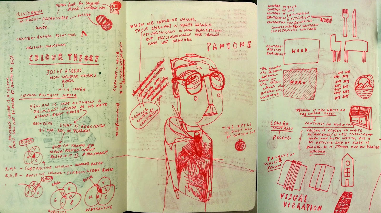
Colour, Value, Notan

Using different strengths of colour to create pathway for eye to follow and to highlight/bring to the forefront certain elements - not sure how balanced this image is but I don't want to follow the set out templates of what is good or bad in handout - I like this - white highlights/accents the red - lower intensity for background using watercolour wash of same red - thickly applied to intensify saturation. Looks better in person on paper and in certain light? - Colour always affected by environment work is placed in
I am disappointed with my lack of developmental work for this, I started this image as a rough and then became engrossed in the process of making a 'nice' image and ended up with a finished picture backed up by nothing... but I like it despite knowing it could have been better with planning. This is still a big problem area of my work process.


'Peltonturbin' inside the turbines
No comments:
Post a Comment