29/04/2014

Persons of Note - Final Resolutions

I am really happy with what I have managed to achieve despite my setback, the series works well in terms of continuity and visual quality. I have taken the time to consider each element much more in depth and alter it accordingly. I feel as though I could take this way of working even further and create something much bigger and much more detailed than this, in future I will aim to manage my time better than I did on this project, to avoid the issues I had so late on.

Poster


I have employed the same techniques used to improve the face and created a new poster that depicts Gandhi giving away his only flip flop as a reference to the story from my research, where his footwear slipped off onto the train tracks and he decided to throw down his remaining shoe so whoever found them had a pair. I am pleased with the texture and contrast I have been able to create with the denim texture to show creases in the robe. It has been quite difficult trying to find areas of light and dark with the right transition/gradient for each layer. The face now includes the sides of Gandhi's hair, more detailed and three dimensional facial features and a revised colour palette. The white space works in creating a focal point, Gandhi comes to life and is not dulled down by his surroundings.

Postcards


The images are much lighter than before, this better communicates peace and freedom. The glasses are now a highlight and create a main focal point better than before. I have altered the prayer symbolism and made the left arm lighter, it was highlighted in the crit that the contrast in light and dark hands could be misread as equality. Cropping the face even further down works better in bringing the eyes to your attention - is much more dynamic and makes use of the wide dimensions of the postcards.

Stamps


The final stamps have also been reworked to fit with the new poster and postcards, they are no longer direct crops of the face, just individual symbols that I have created for the eyes. These work better since they come across as being considered and thought out and less of a copy and past job. 

28/04/2014

Persons of Note - Reworking/Finalising


I have muted the blue, making it less saturated. This gives the image a much calmer feeling, the background is no longer being used because it blends too much into the face and nothing stands out. During the final crit I was told that the colours could be changed to reflect my earlier drawings and experimentation, apparently that would reflect Gandhi's colourful life, but I like the simple palette I currently have, it would be very difficult to match and adjust a range of colours with all of the layers I am using, since I am already alternating the tones and value of each. I am cutting and applying new areas of texture to add more detail and depth.


Highlights and shadows - giving him a more 3D appearance


Proposed new poster idea - giving away only flip flop illustrates the  'compassionate in creative ways' story about when Gandhi was on a train - using same style of digital collage

Persons of Note - Colour - Communication


Despite being advised to in my crit, changing the colours up is more difficult than I thought, none of them seem to communicate peace and freedom as well as blue, the red looks angry and the others don't show enough contrast making the image very washed out. May be to do with blue appearing black in it's darker values?

Persons of Note - Final Crit

 I am disappointed in myself after today because my lack of progress has affected the final crit in the sense that I didn't get to present anything final. I had to present my digital roughs which are no where near completion despite being so close to the deadline. The feedback I received is clearly affected by this, I didn't get as much back because the quality of the work I presented was lacking. I am confident that I can take these comments and suggestions on board and resolve the problems before the deadline. 


Rubbish composition, rushed, no consideration for the format, floating images, border and background irrelevant - space filling - probably the worst piece of work I have produced all year

My poster is a disaster at the moment and was a messy job put together very quickly, this is definitely being reworked. I need to create something new rather than repeating the face of Gandhi across all three formats, this is making my work appear lazy and rushed. I am going to focus on the composition of things, maybe I can make the postcards more dynamic by cropping them down? The artwork itself needs more time and effort, there could definitely be more collage and texture. The labor invested into a piece of work is most clearly evident in the details, it needs to be more intricate and considered.


Self Evaluation - Plan of Action

25/04/2014

Persons of Note - Digital Development

Rough Final Work

These are my postcards and stamps so far, I am pleased with the progress I have made, the textures and varying levels of dark and lighter blue contrast nicely to define the different elements. I have been now been able to incorporate all 4 symbols and cropped around them to create the stamps. Working in this way is very time consuming for me because I am so indecisive, I am worrying about having my work ready on time as I am still not 100% happy and still need a poster.


21/04/2014

End of Module Evaluation

 1.  Which practical skills and methodologies have you developed within this module and how effectively do you think you are employing them within your own practice?

During the course of this module I feel that my collage and analog image making skills have greatly improved, I am finding that image making is now much more intuitive and exciting after learning the breadth of design elements that go into making a picture. Comparing my work now to the work I was generating before I started the course, it is clear to me that I am much more aware of the placement of objects through collage and the consequences this has on composition and the readability of an image. My basic drawing skills have also improved through working from reference and observation, I found these sessions to be the most useful and helpful in altering and improving my work, focusing on the fundamental basics and knowledge of the subject which is something that I haven't always considered enough.


In the picture above I have used observational drawing as a way to understand how the mirrors in Rjukan were constructed, but I was able to retain some of my previous ways of working and combining this way of working with collage has some interesting aesthetic qualities - I like the balance and contrast between heavy and lightly detailed mark making.

2. Which principles/ theories of image making have you found most valuable during this module and how effectively do you think you are employing these within your own practice?  

I have found the principles and theories surrounding line of sight, viewpoint and depth to be the most interesting and helpful to my practice. Before learning much about these areas I rarely ever thought about depth and perception, I think this negatively affected a lot of my work which combined a lot of different visual key elements like tone of line and texture, but lacked that something extra to bring the image to life and to give it clear focal points. Employing these principles and theories within my own work has resulted in much more balanced, engaging and effective illustration. However I don't feel as if I am using these new skills enough within my current work and am going to work towards taking the time to think longer and harder before I make a mark. I need to stop going with the flow of things sometimes and refocus/remember what my intentions are and how best to convey them, for example in the drawing below I considered depth and line of sight but didn't make strong enough diagonal lines to accentuate the machinery trailing off into the distance, I got too caught up in colour and texture.


3. What strengths can you identify within your Visual Language submission can you capitalise on these?

Exploring through playing with a variety of media as well as techniques to apply them has been my key focus point and I think a strength throughout most of the module whether I am looking at shape or line etc. This is a way of working that comes most naturally to me but feeling comfortable has been offset by the other skills I have learnt and trying to combine them with my existing ones. I feel as if my sketchbooks can sometimes become a comfort zone and as a result my work often feels like it must always work in a series and there is never one defining moment or favourite piece of work. I have tried to a couple of times to try something else and worked  on sheets of newspaper for my composition task, which allowed my work to become much more 'complete' and focused, since I knew it was a standalone piece and was self reliant, not needing the support of a sketchbook to explain it. This made the work much more legible and in some respects less abstract, but I feel as if this is one of the notable strengths and key breakthroughs within my practice that I would like to keep up.

4. What areas for development can you identify within your Visual Language submission and how will you address these in the future?  

I think my body of work is slightly lacking in 'exhaustive' drawing that focuses on the repetition and complete understanding of things. I am pleased with the quality of my work but it is sometimes difficult for me to find a balance between quantity and quality. I am going to have to work harder in future to make sure that I can make enough time for thorough drawing sessions and must also become less critical of my own developmental work. Roughs and scamps are still an issue I am struggling to tackle, I usually get so caught up in other elements that are more 'fun' or visually rewarding that initial planning is sometimes forgotten, I am currently rectifying this with my other projects and am limiting my drawing equipment so as not to be tempted to start creating and stop thinking. This is similar to what I said before about thinking before mark making.

5. In what way has this module informed how you deconstruct and analyse artwork (whether your own or that of contemporary practitioners)?

I appreciate other people's work much more after looking at how labor intensive and difficult it can be to make a widely accepted 'successful' image. Looking at a variety of professional work and making sense of each with the principles and theories we have learnt about has made me realise the importance of consideration and thinking before doing. I am starting to see patterns within certain practitioners work and set ways to do things that guarantee certain outcomes in the work, for example harmonious curved lines creating a tranquil and flowing image. As a result of everything I have learnt I am much more critical of myself but this is essential if I want to continue improving and stay motivated in whatever area of work I find myself in.


13/04/2014

Drawings from Reference - Rjukan Norsk & Colour Theory, Value, Notan


After finishing my work for OUIL405 on the Norwegian town Rjukan I have decided that I would like to continue the work and also make drawings about another part of the town using all of the key elements like shape, pattern, line etc. that I have learnt over the course of this module. I have been looking at Norsk Hydro Rjukan, a plant that manufactured chemicals for the production of fertilizer between 1907 and 1991. I think it is a good change to be making drawings using subject matter of a mechanical nature in contrast looking at the Galapagos Islands, it involves different line work and use of shape. Harder lines - more linear - considering angle and proportion


Drawing machinery and mechanics from reference - Rjukan mirrors - I like the contrast between the finer detailing of the pen drawing and the burst of heavy block of oil pastel - working like this gives the picture a balance and added sense of energy - light beam

Overlaying yellow oil pastel affects the colours underneath - mutes them and gives them a warmer tone, I especially like how the blue pen line drawing stands out from behind the layer of yellow - makes uncovered areas stand out even more


Sam Eyde, the artist whose idea it was to install the mirrors in Rjukan - I wanted to try and focus on my initial line work and drawing with a reduced amount of media - this has allowed me to convey the idea and message much more effectively - simple communication


Old turbines from Vermork Power Plant (Tinn, just outside Rjukan, Norway)

Blue circles - block colour and paired down collage on left reflecting the layered machinery opposite - breaking down image into simple elements of colour, shape and order - the circles suggest the continuation of machinery into the distance even though the initial 'drawing' with pencil has stopped


Gold foil - piping in machinery - highlights/contrasts - complements darker reds and purples - block shapes combined with texture and line work - harsh mechanical vs analog


Drawing from reference - Vemork 1 Power Station - Rjukan - studying the turbines used in one of the power stations has actually given me some understanding of how they work without even having to read about it - observation leading to knowledge about the subject matter


Norsk Hydro Rjukan - basic shape - tape - overlayed drawing - orange/yellow/cadmium

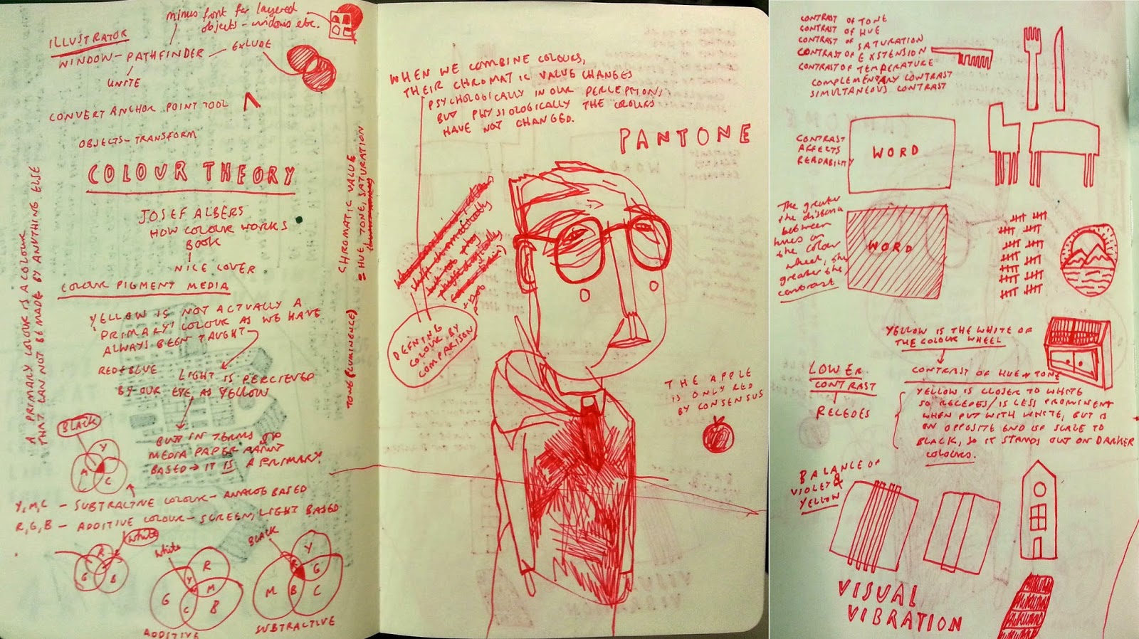
Colour Theory


Colour, Value, Notan


Using different strengths of colour to create pathway for eye to follow and to highlight/bring to the forefront certain elements - not sure how balanced this image is but I don't want to follow the set out templates of what is good or bad in handout - I like this - white highlights/accents the red - lower intensity for background using watercolour wash of same red - thickly applied to intensify saturation. Looks better in person on paper and in certain light? - Colour always affected by environment work is placed in

I am disappointed with my lack of developmental work for this, I started this image as a rough and then became engrossed in the process of making a 'nice' image and ended up with a finished picture backed up by nothing... but I like it despite knowing it could have been better with planning. This is still a big problem area of my work process.


'Peltonturbin' inside the turbines

10/04/2014

Persons of Note - Scanned Textures - Digital Collage

I have been scanning in different textures and newspapers to digitally collage with in Photoshop, I have used a really high dpi for the newsprint so that I am able to see the halftone dots which give my work a more handmade aesthetic. I have tried to find surfaces with a lot of contrast between light and dark, with uneven tones and marks to stop my work looking flat and sterile.


I am trying out the lasso tool to cut out areas of light and shade of the newsprint, which is built up gradually in layers to create Gandhi's face. I am really pleased with how my work is progressing, I am happy with the combination of analog and digital and the benefits layers which is allowing me to continuously rearrange. 


Using one a scan of my own drawing to guide me with the lasso tool, just taking the shapes


Unsure about which textures to use and the blue hue that I am using - some too dark and others have too much texture - want shadows and light and dark - will need to alter the brightness of other layers to face


Constrasting textures - denim diagonal lines work nicely with more subtle sky, the eye brows and moustache have been created using the hair photograph from the newspaper for added texture


Could have the inside of the eye a contrasting yellow hue? Light? Unsure about how this looks on screen, I have thought about using photographs of Gandhi throughout his lifetime inside the lenses of the glasses, but they overally effect is too digitial looking which is something I want to steer a way from. It is quite difficult trying to retain the rough and handmade aesthetic I am used to, I am purposely being messy in the way I lasso areas of paper so they almost appear to be cut with scissors. I don't want to many perfect edges.


I am desaturating and changing the levels of the scanned paper then tinting it with this colour blue to create a contrasting monochromatic image, the different values are working well with the changes in texture and light and dark - maybe the background could be lighter? I am unsure just how much to blend the foreground and background together? I want a full image though...