24/02/2014

Studio Brief 2 - Greetings from...


I am required to capture the visual aesthetic and essence of each city in order for the final postcards to be recognisable - research into monuments, landmarks, well known signs colours shapes etc, skylines

I have been thinking about the cities I would like to illustrate - want a diverse range - all parts of  the world - Rio de Janeiro, Cairo, London, NYC -visual research needed  - what are these cityscapes defined by - think small as well as big - taxis - yellow cabs in new york - a certain type of taxi in london - could visually link using same object in each city but including it's differences - public transport - roads - mail box - phone boxes in london


Christ the Redeemer - Rio - foreground - mid ground - background - blocks of shadow - silhouette good for illustrator and basic shapes


Yellow cabs & Statue of Liberty - New York  - grid lock - pattern of cars - standstill


Pyramids - Cairo - geometric patterns - simple repetition?


London - Buses - phone boxes - buses - red highlight theme colour - cars disappearing behind buildings - layers in illustrator

That's Pants - Final Crit - Evaluation

We worked well as a group overall and despite a few hiccups along the way I would say our GIF is successful, however the poster suffered due to a lack of communication towards the end, we maybe should have organised more meetings towards the deadline so momentum wasn't lost. We were good at combining ideas and I felt as if I was able to voice my opinions well, organisation was generally good up until we finished with our photographs and costume, if I were to work within a group again I would probably make a timetable which everyone could stick to.


22/02/2014

That's Pants - Final GIF


Our GIF includes humor combined with situations the viewer can relate to/has probably needed a poo in before...

That's Pants - Possible Poster?


Above is the poster created by Rowena, I am unsure of the overall result. I think that the image as a whole feels rushed and almost unfinished, I am not to keen on how the space surrounding the type and image has been considered. I think that the communication of our message suffers as a result.


I have had a go at making my own version, using one of the photos from our GIF that sums up our message, I think it is important that the person and the poo are together in one image, since that is what we have focused our whole project around - how it affects the person, highlighting an annoyance. I have used the texture of a cake in Photoshop to get the type looking like sewage. I am hoping the message is clear, the group seems divided on which poster to use but I feel as if more time and effort should have been allocated to making the poster as a group rather than relying on an individual.

20/02/2014

Cyntiq - Line & Shape


brushes in photoshop - different textures - lasso tool - cut out - window - transparency - using cyntiq gave me a greater sense of control of the line work - became much more intuitive and was a much quicker way of working

That's Pants - Photos for The Bowel Growl GIF


I think we did well to get a range of different scenarios/settings and we managed our time well getting it all done before it got too dark. We didn't really have a plan as to what exact pose would be used in each of the photos, we knew it would be much easier to determine the right shots once we were out and about in the locations themselves.


Wacom Cintiq drawing - cutting - digital brush - layers

19/02/2014

Viewpoint & Depth


Working with depth and viewpoint to create work which makes use of foreground, midground, background to show points of perspective and direction - movement - dynamism - fluidity - more effective imagery. Rough of baby being passed over fence - first person view - more confrontational and visually striking than if the image was a flat one dimensional drawing that clearly showed the situation - viewpoint can add context and affect the overall mood/feeling. I am now considering proportion a lot more carefully - relationship between objects

Line of sight - looking from above/away/over/through something


Final etching of picture of Rjukan using viewpoint and depth to show the beams of light coming down the mountain towards viewer - this image could be improved with a clearer separation between the beackground, midground and foreground - more contrast through scale and juxtapositioning

18/02/2014

That's Pants - Finishing Costume - Planning Locations

With our new plan and project aim which is to show how the annoyance of 'bowl growl' (needing the toilet but being unable to get to one) we can still incorporate our costume. It will be used as the constant reminder of a bowel movement in our photographs for the GIF and Poster - It will follow the person being photographed around, into inconvenient and awkward situations

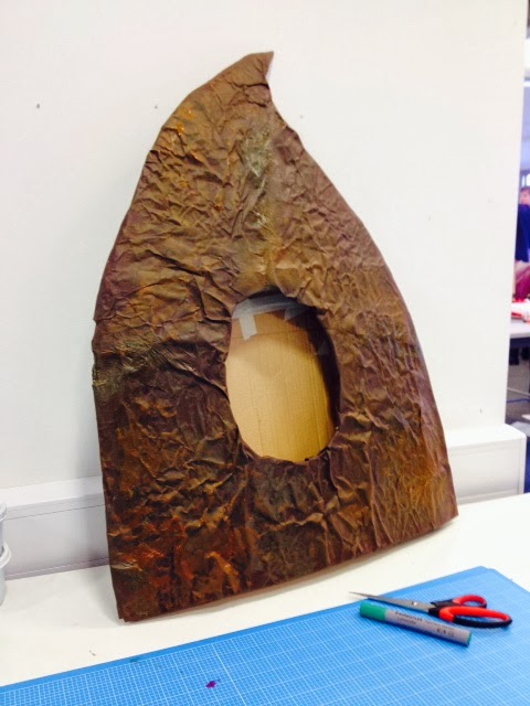
Continuing with our poo costume to be used in photos - painting, paper mache - finalising


Using brown paper, glue and paper mache to add texture on top of newspaper - painting over the surface to give it a 'pooey' texture


This original top half to the costume went missing so we have been forced to make a new one...


The sizing of the hole for the head and the distance between the neck and body need adjusting, needs to fit everyone in the group and be comfortable - is difficult to walk in...

We have been planning where to take the costume for the photographs of 'the bowl growl'
  • The phone box across the road from college
  • The bus stop outside college
  • The bus (to Morrisons from college)
  • Morrisons supermarket - toilet roll aisle
  • Into town - the library
  • One of the shopping centres
  • The train station
We will all be taking turns wearing the costume and alternate who takes the photos, we are hoping to get a lot of unexpected photos in locations we see along the way as well.

14/02/2014

That's Pants - Answering the Brief - Another Change of Plan

  • After speaking with Matt and Fred about our ideas we have realised as a group that our new plan to make a toilet paradise isn't answering the brief. We need to highlight something which is pants but instead we are almost doing the opposite by saying 'public toilets are nice'.
  • Need something that is easy and simple - a problem that can be so obscure it is silly, but if we believe it needs highlighting then that is fine - just to make people laugh
  • New plan - It's pants when you need to poo but there are no toilets - we can still use the poo costume - not wasted - and create a series of photographs with the poo bugging you in public situations when there are no toilets e.g. the bus stop, the phone box etc.
  • As a group it has been really helpful to combine thoughts and ideas, we realised this mistake through a discussion about our goals and re-assessing the work
Slogan - The Bowl Growl

13/02/2014

That's Pants - Change of Plan

As a group it has become clear to us that none of our research matches up with our real world findings...
  • We have wrongly accused public toilets - after going out to find ones to photograph we can't find any 'bad' enough ones that match our research - this means we are wrong in portraying them in this way
  • Now want to do 'toilet make over' making a toilet nice that will make people realise our public toilets are actually okay
  • Make card cut outs and objects - flowers etc to decorate toilets? Toilet Paradise?
  • No longer need Poo costume? Waste of time?


11/02/2014

That's Pants - Ideas Development - Alternative Ideas and Research

Our group doesn't just want to focus solely on the costume idea anymore, we agreed that whilst we are still working on that idea we could look into other solutions as back up, I kind of feel like we took that idea and ran with it too early on. We have been getting a little bit confused about our overall message, I feel as if we are doing something quite broad and maybe we could simplify it, but investing time into making things like the costume makes me think we need to work around it and think of other ways we could incorporate it should our focus change.

Dressing up toilets? GIF could show us makeover a toilet - poster - photo of before/after - nice clean toilet at start of day - disgusting at the end?

toilets

Toilet make over to make people want to look after them? Lava Mae company in San Francisco trying to make nice public toilets - raise awareness for lack of - dresses them up - maybe decrease level of disrespect towards public toilets - makes you want to look after them - maybe not the fluffy one though


Maybe an activist group that has poster made in propoganda style - trying to get the public to look after the toilets - mascot costume guy can be in it - holding toilet brush - highlights 'clean' - somehow photograph funny 'Poolitical' campaign and turn it into a GIF? Possible slogan "Rid the skid".


At the beginning of the project I think that we were a lot more decisive but I think this has started to become a slight issue as we keep searching for a successful idea, after a crit of our work we realised that this idea was maybe a bit over the top and we wouldn't be able to pull it off as well as we'd hoped. We need something much simpler and easy to understand, it isn't exactly clear what 'Pooliticians' stands for without going into detail.